This article explores some of the best modern logo designs created by the top logo designers today.
Most companies opt for modern designs to show they can ride the latest trends and communicate with an ever-changing target audience. That's why the best logo designs feature modern elements that demonstrate their commitment to catching up with the present times.
1. Studio Raízes - Arquitetura & Emoção by Kangoo Works
Standout Features:
- Meaningful
- Stylish typeface
- Earthy color story
Studio Raízes - Arquitetura & Emoção's logo design by Kangoo Works taps into the natural elements and translates it into a modern logo design with a fantastic concept.
The logo design takes inspiration from "Raízes," meaning "roots" in Portuguese. It embodies nourishment and growth, akin to a tree's roots. The typographic design and the earthy color palette reinforce this theme and create a unique and cohesive visual representation.
2. D3 Cafe & Restro branding by XAXs Corps
Standout Features:
- Monogram logo
- Versatile design
- Simple and meaningful
D3 Cafe & Restro's logo design by XAXs Corps features few visual elements, making this simple design stand out.
The most successful logo designs are usually simple and uncluttered. That's why people easily recognize and remember them. The logo boasts a monogram incorporating D and 3, a playful touch to the brand name.
Its versatile design makes incorporating the logo into various visual assets effortless. The modern-looking typeface gives off a premium yet welcoming look, which is what the restaurant aims to be as a fine dining establishment.
3. LuxiVerse by FIMA
Standout Features:
- Horizontal layout
- Stylish typography
- Luxurious color palette
Design agency FIMA tapped into its creative roots to develop a modern logo design for LuxiVerse, focusing on making it look effortlessly elegant.
The logo design features a stylish serif typeface, thin and seemingly lightweight. They also used deep purple and black as the primary colors, usually associated with luxury and power. Lastly, the horizontal layout makes it easier for artists to use their logos in print or website designs.
4. Concept Room by Sign Up Digital
Standout Features:
- Clever use of initials
- Interlinking letters
- Sharp edges
For Concept Room's logo design, Sign Up Digital interlinked the brand's initials (C and R) and designed a modern logo that fits well with the brand.
The creative representation of brand initials in the logo is simple and convenient, a reflection of the brand as a home interior shop. Modern and sleek, this perfectly captures the essence of the store and helps with brand recall.
5. Muñoz Group by DD.NYC®
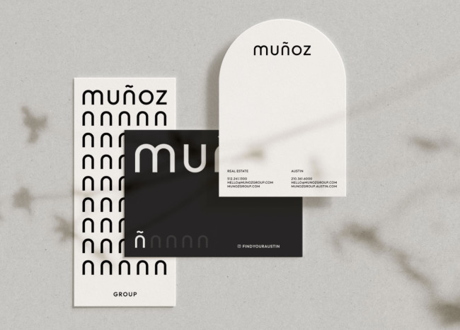
Standout Features:
- Monochromatic color story
- Curved edged letters
- Minimalist and clean
With its clean and minimalist design concept, the Muñoz Group’s logo design by DD.NYC® makes it to our list of the best modern logo designs.
The curved-edged letters provide the right amount of softness to the otherwise rigid exterior of the logo, and the monochromatic color story makes it easier for artists and designers to incorporate the logos in various visual assets, from print to website designs and anything in between.
6. Botteghe Sostenibili by Mauro Ghezzo
Standout Features:
- Paper bag image
- Sans-serif font
- Sustainable
Botteghe Sostenibili tapped logo designer Mauro Ghezzo to develop a modern logo design that best represents them as a locally-owned sustainability-focused brand. The result was a simple, impactful, and remarkable logo that was perfect for them.
One of the noticeable features of this logo design is the paper bag placed below the stylized B, which is a nod to its environmentally aligned values. They also used a sans-serif font that adds a layer of trust to the brand. After all, sans-serif fonts symbolize reliability and trustworthiness.
7. Next Frotas Logo by Guedz

Standout Features:
- Evocative symbol
- Unique letters
- Simple and impactful
For Next Frotas’s logo design, design agency Guedz used symbols that the audience will easily capture without being too obvious, such as the more-than (>) sign.
Having it as a part of the brand’s spelling, it signifies the desire of Next Frotas to be more than just a demobilization company for businesses. The simple design makes them look like they mean business, and it is indeed simple yet impactful.
8. The Bad Leader by WR Digital Marketing

Standout Features:
- Two open triangles
- Lightning on the letter D
- Thick sans-serif font
The Bad Leader’s logo design by WR Digital Marketing combines various visual elements seamlessly without looking too overwhelming to the target audiences.
From the two open triangles on top of each other signifying progress to the lightning on the D in Bad implying strength and power, to the thick sans-serif font symbolizing security and safety, this modern logo design ticks all the boxes and so much more.
SOURCE DesignRush

